
Online, people are used to the overload of “stylistic noise,” making the pursuit of design clarity and simplicity a need. Design publications note that the biggest graphic design trends of 2026 include visual index design, as well as micrographics. The longing for more organized, simpler times in the current hyper-digital design existence only makes sense. It’s a way of mentally decluttering.
Harshal Duddalwar, a New York City-based designer and art director, would know. He advocates for a design approach rooted in what he calls “geometric thinking.” As Duddalwar shapes brand identity and visual systems at Astronaut Monastery, his work for technology, venture, and cultural organizations serves as a case study in how structured, mathematical precision can be leveraged to humanize complex information.
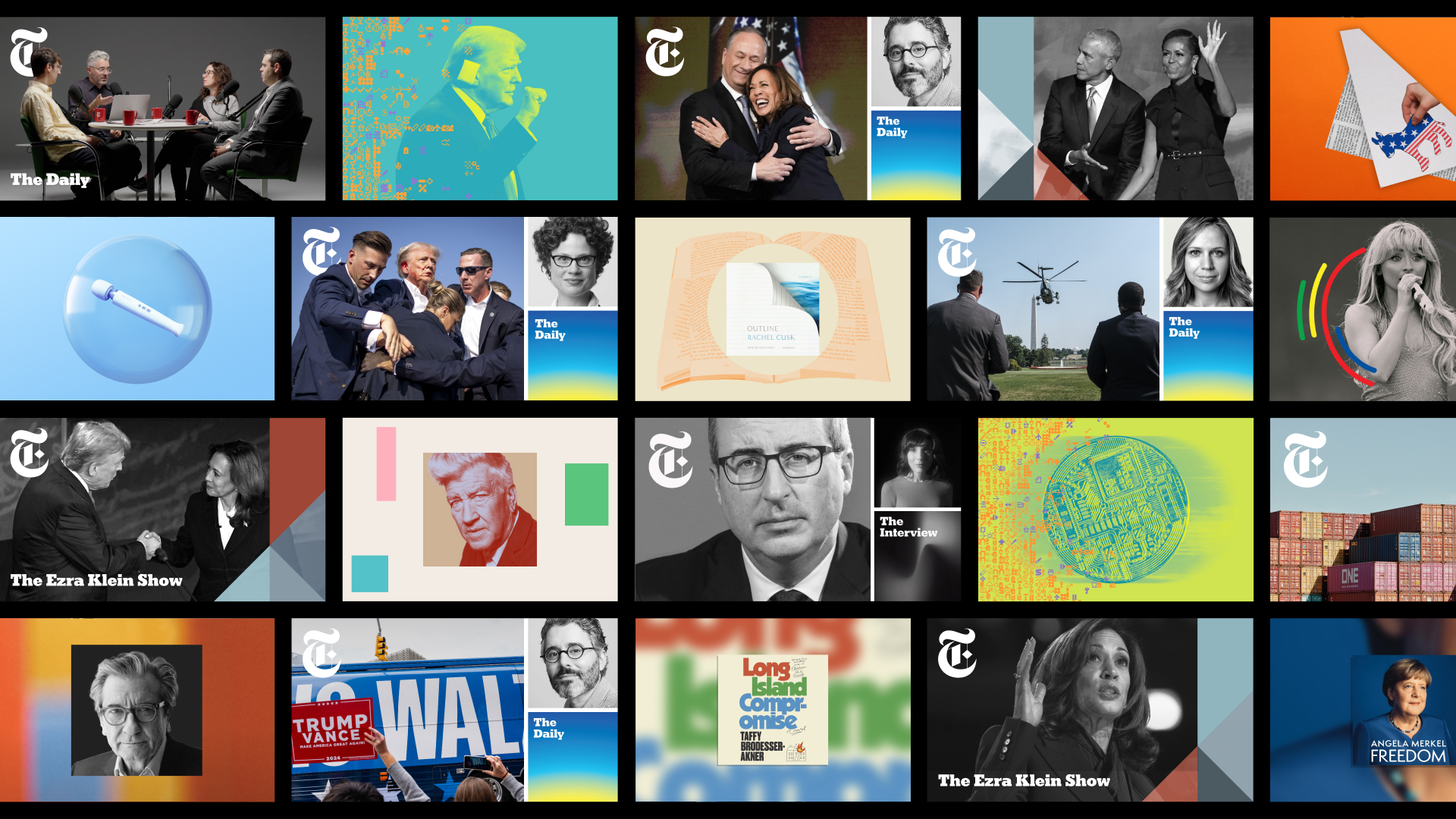
Duddalwar’s own shift, from preparing for a career in medicine in India to graduating from the Rhode Island School of Design (RISD), which is one of the world’s most selective design programs, has an analytical, if not surgical, approach to visual systems. His career, which includes tenures at The New York Times, 2×4, Pentagram, and Microsoft, reflects a consistent obsession with the relationship between form and intent.
To the average person, geometry in design often translates to the simple use of circles, squares, and triangles. However, for Duddalwar, geometric thinking is a cognitive framework, rather than a stylistic choice.
“Geometric thinking is not about shapes, as much as it is about relationships,” Duddalwar explains. “It is a way of reducing complexity into something structured and legible. When I think geometrically, I am asking what is essential and how elements relate to each other in space.”
This approach brings a specific discipline to his work, involving proportion, alignment, repetition, and contrast. These are not merely aesthetic preferences; they are tools used to shape how a viewer understands information. By utilizing geometry, Duddalwar creates a sense of neutrality and simplicity.
This neutrality is critical in branding, as it allows the core idea to surface without being obscured by fleeting trends. Over time, this becomes a consistent, bold language that allows a designer to navigate diverse projects, from high-tech venture capital firms to cultural institutions, while maintaining cognitive clarity.
At Astronaut Monastery, an independent creative studio working with technology companies, venture-backed startups, and cultural organizations on branding, design, and creative development, Duddalwar focuses on building visual languages for organizations. He often starts with abstract or complex concepts, though his process relies on the implementation of strict, foundational systems: a clear grid, a defined typographic hierarchy, and a restrained but intentional color palette.
But that doesn’t mean his design approach is formulaic. “The system does not restrict creativity,” said Duddalwar. “It actually allows more freedom within a clear structure.”
A significant portion of his methodology involves considering “application” at the earliest stages.
In this digitally-driven era, a brand identity must scale seamlessly from a mobile app icon to a website, a billboard, or beyond. By building rules around imagery, illustration, and motion early on, Duddalwar ensures that the brand remains coherent across all touchpoints.
He argues that the verbal component of a brand is just as important as the visual aspect of branding. “How the brand sounds is as important as how it looks,” he said. When all of these layers (the visual, the verbal, and the systematic) all align together, the resulting identity feels natural, if not intuitive.
This alignment is what Duddalwar defines as “clarity of intent.” A logo or a color palette is merely a symptom of a deeper set of decisions that must be repeated consistently to build recognition and meaning.
Typography plays a key role in Duddalwar’s graphic design work, acting as the bridge between structure and narrative. His preference for typefaces like Neue Haas Grotesk and other “Grotesque” families stems from a need for neutrality and high legibility. These fonts provide a clean slate that complements the design and does not compete with the brand’s message.
To create depth, he often introduces traditional serif families for contrast. This juxtaposition allows for a broader range of expression, enabling a brand to feel both modern and historically grounded.
The challenge, however, lies in the balance between text and visual elements. Duddalwar views this not through fixed rules, but through the context of each case study or medium. “A website, a publication, or a campaign each demands a different relationship between text and image,” he says. “I try to treat both as equal parts of a composition. Typography carries structure and tone, while visuals extend the narrative.” When executed correctly, the reader moves through the content without friction, a hallmark of successful user-centered design.
Duddalwar’s early path toward medicine informs a compelling subtext to his design philosophy. The transition from studying biological systems to creating his own anatomy of visual systems has resulted in a practice that is both highly analytical and deeply human-centered. This duality was further refined during his MFA at RISD, a program known for its rigorous critique and microscopic focus on form.
His professional history has been at some of the world’s most influential design hubs. At The New York Times, he was part of the Brand Identity team, contributing to initiatives such as NYT Audio, which was a project that required translating a legacy print brand into a modern, auditory-first digital experience. His time at Pentagram and 2×4 further solidified his ability to work at the intersection of architecture, culture, and technology.
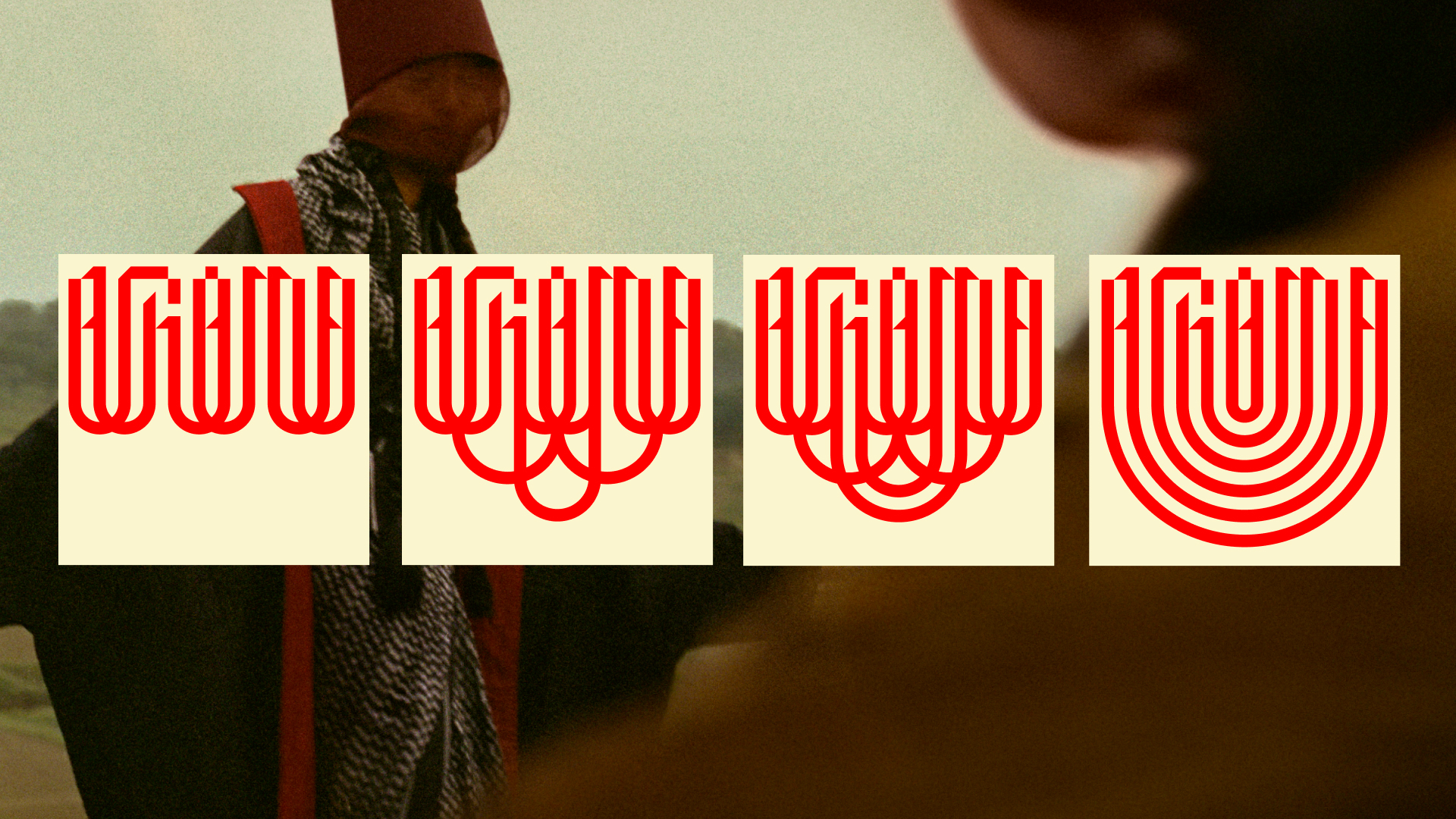
While his commercial work is defined by structure and client objectives, Duddalwar maintains a robust series of personal projects that serve as an R&D (research and development) lab for his creative theories. His design projects, like “Alankar,” explore the ornamentation of the Devnagari script through a structured lens, questioning how traditional typography can be modernized without losing its cultural essence, while “Ponder and One Day At A Time” represent a shift toward the reflective, focusing on lived experiences and the value of everyday moments.
One of his more popular projects, a communal design piece called “Table for One Too Many,” documents the act of meeting people over meals and recording their “comfort recipes.” This project, along with “Meandering,” a practice of observing and collecting daily moments in New York City, offsets the mathematical rigidity of his commercial work with a sense of warmth and human connection.
“These projects inform my commercial work, as much as the other way around,” Duddalwar says. They allow him to test how much a concept can be stripped down while still retaining its core idea.
Beyond his design portfolio work, Duddalwar is an active participant in the design discourse. By conducting portfolio reviews at CMU, RISD, Parsons, University of North Florida, among others, and speaking at institutions like the Pratt Institute, he mentors the next generation of designers on the importance of “visual thinking.” His recognition by the Kyoorius Young Blood Awards and the Adobe Design Achievement Awards underscores his influence in the field.
As technology continues to evolve, the demand for designers who can synthesize complex data into elegant, legible systems is likely to grow. Duddalwar’s own geometric approach remains resilient in uncertain times. “At its core, it is clarity of intent,” he said. “Brand identity is a set of decisions that repeat over time. Consistency builds recognition, but intention gives it meaning. Good communication feels natural because it is aligned at every level. When that alignment is missing, even well-designed elements feel disconnected.”